November 2nd, 2011 8:08 pm by Vincent Flanders

Submitter’s comments: This one really sucks…It’s from a small town’s (Engenhahn) local committee of one of Germany’s major parties (Social Democrats, SPD). Doesn’t even feature the party’s logo or colors, though, but that might actually be a rather good idea…
Vincent Flanders’ comments: In this day and age, you often don’t want people to know your party affiliation. The only people who can look at the thumbnail and say, “Verdammt, das ist glatt (Damn, this is smooth)” are the people who authorized the site. Everyone else sees it for the sucker it is. Speaking of “Verdammt, das ist glatt,” I came up with this phrase using Google Translate. Google also came up with “Marius White – a member of parliament to touch.” Somehow, I don’t think this is the correct translation.
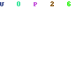
I love the repeating background, the home page TITLE tag of “home” and the multi-colored text.
spd-engenhahn
Posted in Daily Sucker, Usability, Web Design, Worst Web Sites |
November 2nd, 2011 5:05 am by Vincent Flanders

Submitter’s comments: Uh…what gives with the light text?
Vincent Flanders’ comments: If #666 is Satan’s CSS and violates the W3C’s guidelines on contrast, then TechChrunch Disrupt’s destroys it with text that is #888–33% more Satanic. The regular TechCrunch site uses #000, your standard black text. I read TechCrunch at least 3 times a day. I won’t be reading future Disrupts’
TechCrunch Disrupt
Posted in Daily Sucker, Usability, Web Design |
November 2nd, 2011 5:05 am by Vincent Flanders

Submitter’s comments: I can’t read it very well.
Vincent Flanders’ comments: For those of you who don’t understand the concept of contrast, my Daily Sucker from 9-9-9 explains it quite well.
Even though the line height on FedEx’s home page keeps the text separated, it requires effort to read the page. Visitors shouldn’t have to strain to read your text. FedEx uses #666– Satan’s CSS — throughout their site. I’ve met a few of their web employees and they’re too smart for this.
EedEx
Posted in Daily Sucker, Usability, Web Design |
October 31st, 2011 6:06 am by Vincent Flanders
http://design.ucdavis.edu/ – Sucks. Sucks. Sucks. Then to suck it up further, it’s Flash.
Original article. Oh. This reading list sucks in Chrome. You want to talk about tiny, tiny type…
Catch UC Davis’ flying birds. Yes, they may be the best flying birds on the web, but it’s still the best of a bad technique you should never, ever use on your site.
Posted in Daily Sucker, Usability, Web Design, Worst Web Sites |
October 30th, 2011 8:08 pm by Vincent Flanders
Submitter’s comments: Well it seems that some art critics do not apply their talent and knowledge to their own websites. This one is a classic Mystery Meat Navigation case associated with multiple scrollbars and stuff. Oh my!
Vincent Flanders’ comments: I agree. Why not just set it up with four columns? The other thing that’s amusing is that when I told Google to translate the page, it said it did. No, it didn’t. There’s a function on the options drop-down where you can tell Google there’s a problem. That brings up a new problem. You can only tell Google they have the wrong language. You can’t tell them they didn’t translate the page.
Reticencias
Posted in Daily Sucker, Usability, Web Design |

