Worst Web Sites 2009
Worst Business Websites of 2009, But You Can Learn Something From Them
Worst Business Websites of 2009
Worst Business Websites to Navigate in 2009
Worst Websites of 2009: Honorary Winners
Worst Over The Top Websites of 2009
Worst Non-Profit Websites of 2009
Gorgeous Websites From The Late 90's To Inspire You — If You Have No Taste
Worst Web Sites 2008
Worst Web Sites 2007
Worst Web Sites 2006
More Bad Web Design
Daily Sucker
Daily Examples of Bad Web Design
Web Design Checklists
Checklist 1
149 Ways to Kill Your Web Site
Checklist 2
82 Ways to Ruin Your Web Site
Miscellaneous
![]() Back to The Worst Web Design Techniques Featured on Web Pages That Suck in 2005
Back to The Worst Web Design Techniques Featured on Web Pages That Suck in 2005
The People's Choice Award for Overall Bad Web Design Award

This site beat some very strong competition — heck, it beat a lot of the other sites that won in their category.
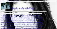
My original comments: This page really confuses me. It's not the home page and, of course, I can't find any links from the home page to this page. It just doesn't look real, but it probably is real.
Why...
- ...is there a background picture that repeats itself?
- ...are there birds and spiders (?) falling down from the top?
- ... are there these white lines across the page (and the woman's face) with blue text?
- ...does the page go on forever?
- ...does the text change color?
- ...is there no organization?
- ...does this site exist?
Reader comments: Needs to scale it waaaaaaaaaay back. Too much going on here. Suggestions:
- Get rid of the falling animation. It's distracting and makes the page hard to read.
- Change the background to something more subtle, or a solid tasteful color. You can barely read the text on that photo, and it looks odd tiled down the page.
- Change the font to something other than all in italics. Yes, italics/script have a wedding tone, but it's hard to read that much text in that type of font.
- Right click disable: It doesn't work. Ever.
Basically the page needs an overhaul. With all due respect to the author, the current colors, layout, etc., are a serious blow to the company's credibility. There needs to be a sleeker, more professional, modern look here.
Wow...there's no way...
I was a little confused when everyone was talking about the birds...and then I clicked the URL bar and BAM! They showed up...Those poor birds, they're just going to keep falling....and falling....and falling.
This site gives some past suckers a good name. I'm in shock. The main site is "eh"...It's a little too distracting though the concept is leaning slightly towards the cool side.
In IE 6, all you have to do to get around the no right click, is go to view and then click source.
Oh yes, and this was created in FrontPage 4.0...I hate FrontPage with a passion, all it does is screw up my home computer.
Which leaves us with Hayden Video Weddings. How doest thou suck? Let me count the ways ... no, on second thought, the numbers involved are too large for mortal comprehension. What I can't get over, every time I look at that page, is that someone actually put that page together, looked at it, and said "this is good!"
For one thing, it's not a web site, it's a web page — it's all one honking huge hideous train wreck of a page. It too gets points for keyword stuffing — look for the tiny print. It's got scrolling text. It's got those crashing things — only by turning JavaScript off could I see they were flowers. You also need to turn JavaScript off if you want a better look at one of their images, since they think there's any person alive who would actually want to copy one.
Then there's the text, that part of it that is not keyword stuffing, that is. Most notably the blue boldface text. They do such strange things with punctuation that I think the Earth's rotation has been subtly shifted by my long-ago high school English teacher spinning in her grave at 7200 RPM. They're trying to explain their services, and they do so rather verbosely, but then they abbreviate "hours" to "hrs" several times.
They have gobs of links for no practical reasons, though I did find the one for a DNA paternity testing service rather amusing, given the topic of the site. And I've saved the best for last: the background. Just why they've chosen to very effectively camouflage most of their site with that high-contrast background image of a rather panicked-looking woman having a bad hair day is totally beyond my comprehension, as is what they think it adds to the site that justifies the 128k it takes up.
![]() Back to The Worst Web Design Techniques Featured on Web Pages That Suck in 2005
Back to The Worst Web Design Techniques Featured on Web Pages That Suck in 2005
