The Worst Web Design Techniques Featured on Web Pages That Suck in 2005

Note: The following sites were first listed eight years ago. Many have been fixed and I've provided screen captures or videos of the original site, if possible.
I started this site back in 1996 and every year I've planned to hold my version of the "Razzies for the Web." I wanted to honor those web sites that made us feel good about our skills — "Hey, my site isn't THAT bad."
In 2005, Web Pages That Suck featured 293 Daily Suckers. Of that total, I considered 117 bad enough to be possible candidates for the "Worst Web Design Techniques Featured on Web Pages That Suck in 2005." The short list consisted of 57 sites.
After viewing the "winners" you'll probably say to yourself, "I've seen worse website car wrecks than what's here." Contrary to public perception, Web Pages That Suck (WPTS) does not just feature web design car-wrecks. If I just wanted car wrecks, I'd put up only sites created with Microsoft FrontPage. These sites have at least one major problem that's seen over and over again. Now that you've seen them, don't make the same mistakes.
Here are the "winners" in my completely arbitrary categories:
The "Worst Web Design Techniques Featured on Web Pages That Suck in 2005" Award Goes to Brown University Graduate School
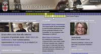
You can run but you can't hide thanks to Archive.org's Wayback Machine. The folks at Brown fixed the site — and made it the way it should have been in the first place. Archive.org has the ugly truth. Mouse over the boxes at the top and you'll some of the worst Mystery Meat Navigation ever created.
The person who suggested this site to me wrote:
"Here's a page with the worst Mystery Meat Navigation I have ever seen. I was thinking of applying to Brown for graduate school, and their web site is pissing me off so much that I will probably just forget about it."
The YouTube video above shows the the bad navigation of the old site along with why the current version sucks.
Vincent Flanders' comments: I've stated many times that it's perfectly OK for certain types of web sites (music, movie, band, personal, gaming and experimental) to use stupid web design techniques because that's what their audience expects. Those types of sites aren't real sites. A real site is about disseminating information and/or selling products/services.
The Brown University Graduate School is a real site, for a real organization and it has a Google Page Rank of 8.
This is just awful. You have to mouse over the words (Admissions, Academics, Support, or Student Life) and then over the bars. I can't believe how bad this site is.
I'm especially fond of the lack of contrast between the text and the background.
Other comments #1: I love it when webmasters defend the indefensible, because they always come out with the wackiest rationalizations to try to explain their very bad decision.
WEBMASTER 1: No, no, you don't understand! We meant to make the navigation hard to use, to reflect the theme of the site, which is "human struggle throughout the ages!"
WEBMASTER 2: No, we meant to simply load fifteen 1.2 MB images on one page, as opposed to allowing visitors to preview them with a thumbnail gallery. We figured having to click on a thumbnail would be too much of a hassle!
WEBMASTER 3: Yes, we planned to carve up the home page into 5 framesets. This was to allow visitors to manage the site in bite-sized chunks.
WEBMASTER 4: If every site was designed to be maximally usable by all users, the Web would be a boring place."
LOL!
This box nav is probably one of the dumbest things I have ever seen on the web, with the rationalization behind it being the dumbest thing I have ever heard on the web. Let me explain why this menu is dumb. It's not even obvious! You would never know those highlighted boxes were links unless you accidentally moused over them or were told beforehand what they were. Why? Because all that happens when you mouse over the text links is that the boxes light up, and there's nothing about the boxes lighting up that tells visitors, "Hey, mouse over us to access different parts of the site." So what's the point of a menu whose function isn't even obvious or self-evident when visitors see it?
LOL!
As for the grad student who wrote: "And really, isn't that what matters? That a Grad student at Brown can find what she needs?" NO, what matters is that the target audience for this site—a person who *isn't* a grad student at Brown but is curious in becoming one — can browse this site to learn more information about it in the quickest and most user-friendly way possible. This site wasn't designed for students of Brown— it was designed for non-students of Brown. I know you want to defend your school and everything, but this menu is ridiculous and even a bit unprofessional.
Other comments #2: I had my daughter check out the Brown Grad web site.
She is definitely in the "target demographic" as she is an undergrad at a private school on the Upper West side of NYC. She is also computer literate; having used computers since age 9. She also knows more about surfing than the average person since Mom and Dad build web sites.
Her initial reaction to this Brown site was confusion. She could not figure out how to start navigating. Then, when she did, she said: "What the..." as the little boxes appeared.
Other comments #3: Some things should be boring. For instance, I don't want excitement when I'm trying to find the controls to my car stereo in traffic. One thing is for certain: if web sites were designed to be maximally usable, they'd certainly be more usable ... something which is very badly needed.
People seeking entertainment generally have a wide assortment of computer games to choose from. The odds are that they're on a commercial web site (yours included) to seek information instead. When entertaining them with "creative" forms of navigation interferes with their quick and easy access to that information, the web site fails. It's a case of a designer putting his desires ("I think we should entertain the users") ahead of the user's needs ("I need information on application deadlines for fall"). But the user is solely interested in his own needs, and a site which doesn't meet them in a way as to be maximally usable by that user is one more impediment between your hand and his wallet.
In the end, it's all about the Benjamins.
Other comments #4: Actually what counts is that anyone who needs to can find the information they need. That's not just students, that includes potential students, their parents, anyone advising potential students and parents of potential students... this list goes on. Some people will find this site great and cool and stuff, while others will find it confusing.
It is actually possible to create a site that is both visually pleasing and functional. The "we've never seen this kind of navigation before" argument can actually be cited as a point against it. To reiterate the car theme again, a friend of mine once bought a second-hand Citroen MX, brushed aside all offers of a quick guided tour of the dashboard, got in and couldn't find the handbrake. Why? Because it wasn't where the handbrake should be, it was next to his left knee. This had to be explained to him before he could test drive the damn thing.
Lots of things are standard. The buttons on your telephone are in a particular configuration. And if you've ever been overseas and gone into an Internet café where the keyboards are all different, it slows you down.
It's generally far better to concentrate on taking the ordinary and making it useful and exciting than to completely ditch the established standards — that should be left to the artists and designers, whose web sites are supposed to push the envelope and be a little bit crazy. If someone hits upon a great idea that looks cool and is intuitive and useful, it'll be noticed and will spread through the net.
Also, the more complicated you make something; the more there is to go wrong. Using IE6 on WinXP at 1024px screen width, try activating the "Support" menu, run your mouse over the submenu until it's just below the "Student life" link and then up to activate the "Student life" link. Then do what most people would do at this point: carefully, without touching any of the inactive blue boxes, move your mouse pointer to the new submenu boxes and try activating them. I don't know about you, but I find I can't then read any of the labels at all — occasionally I see a stray letter over to the right and that's it.
And that's the danger with this sort of thing: when it works perfectly, it appears very cool and neat. But when it doesn't work quite perfectly, it suddenly becomes totally useless.
Archive.org has the ugly truth about how this website once looked.The "Should Be a Shoo-In For Next Year's Worst Web Design Techniques Featured on Web Pages That Suck in 2006" Award Goes to: The Association of International Glaucoma Societies
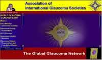
I know only too well that when you think you've been to the edge and seen the worst, something else comes along that sends you over the edge. I wanted to give you a look at the leading candidate for next year's top award.
There are times when you look at a web page and your jaw just drops in amazement. This is one of those times.
Not only do they have their very own "Glaucoma Hymn"as background music, you can choose "Suspicious Minds" by Elvis Presley if you're feeling less operatic.
After being nominated, the organization's attempt to improve the page consisted of removing the hymn — from playing. To try to preserve the feeling of the site, here's an excerpt from a speech I gave that I've posted to YouTube:
Vincent Flanders’ comments: I generally only agree 100% with the submitter, but in this case I agree 210%. What were they thinking when they decided on creating this music? What about the horrid use of frames? Who wanted the bouncing heads? What was the meeting like when everyone looked at the site and said, "Damn, we're smooth"? I'm just stunned.
Other comments #1: Terry Gilliam should not be invoked lightly, but... geez... when they can't bother to convert their directory of member organizations into HTML (worse, in Firefox with JavaScript disabled, the PDF version opens into a frame with no scrollbar), but someone *did* find the time to upload 232 photos from the Imperial Viennese Glaucoma Ball...
Other comments #2: Glaucoma is not a laughing matter, but you'd be forgiven for thinking it was on the strength of this site. Seldom have I seen a site that so comprehensively defeats its own object.
Other comments #3: After looking at this site, I have lost all hope for humanity and seriously considered un-installing my web-browser and moving to the mountains.
Everything about this page makes me sick, from the colors to the animation to hymn playing. Oh wait! That's not all. You can change the music by clicking the giant ugly eye ball! This site is a joke.
 YouTube Video of Glaucoma Society's website
 Here's a higher quality version of the same video at SmugMug
Association of International Glaucoma Societies (Current web site)
 YouTube Video of Glaucoma Society's website
Here's a higher quality version of the same video at SmugMug
Association of International Glaucoma Societies (Current web site)
The "No Spelling Checker Software Will Help You Pubic Service" Award Goes to Haran, Watson & Company:

Of course they fixed the typo — "pubic accountant" instead of "public accountant" — which was, I believe, on every TITLE tag on every page of their site, so here's a screen shot of their very pubic mistake.
It always pays to check, double check and triple check your spelling. After that, get somebody else to check it as well. ESPECIALLY if the error is going to be reproduced on every page of the site :-)
Vincent Flanders' comments: This note reminds me how much I miss one of the spell check features in the old Wang Word Processing system. The feature was "Delete from dictionary" and I don't think any current spell checker offers anything similar. If it did, then this firm of dignified accountants would have deleted the word "pubic" and the title of all their pages wouldn't have ended up "Certified PUBIC Accountants" (I added capitalization).
The folks at Haran Watson & Company shouldn't feel too badly about the mistake because Google found around 11,000 pages that mention a pubic accountant (true when I wrote this back in 2005).
This typo reminds me of the days when I worked in a steno pool. I was typing up the job description of the Director of Information Services and I entered the phrase "Must keep a breast of current developments" instead of "Must keep abreast of current developments."
The "Ars Brevis, Vita Longa" Award for Bad Web Design Goes to: Visual Arts League

Sites like this one and many other of my award winners make me glad Microsoft killed off their FrontPage (or as I like to call it "AffrontPage") HTML editor.
What's most frightening is the site hasn't really changed since 2005. In case it does change, I have a large screen capture (4Mb).
Other comments #1: The Visual Arts League is mind-blowing in its own way: shouldn't artists have some concept of the basic principles of graphic design? Shouldn't they comprehend how to make something not ugly? I have no art training beyond junior high school art classes, but even I know when something looks hideous, and that certainly does. But it doesn't quite reach the eye-tearing horror of some of the others you've featured.
The "Proof That San Francisco Courts Are Going to Hell" Award Goes to: Superior Court of California County of San Francisco
I have no words to describe this creation. One of my readers works in the legal industry and she has to visit this site occasionally to access information about San Francisco courts. She wasn't happy.
Vincent Flanders' comments: This is truly one of the worst government sites I've ever seen — and I've seen plenty of bad ones. Initially, I thought "Well, they made the design this bad because they were trying to use valid HTML." Wrong. There are 47 errors on the home page. I don't think any two pages on the site are alike.
The graphic buttons are a desperate cry for help. We have multi-colored text, scrolling text, buttons that look like links but aren't links, and so many other mistakes that this page should be used as a case study in bad web design. The question that immediately comes to my mind, "Is the legal system in SF just as bad as the court's web design?"
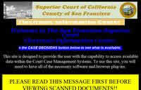
Other comments #1: I am greeted by a huge yellow box with scary headline in scary capital letters and even scarier multiple exclamation marks. Maybe legal types normally communicate in this fashion — somehow, I doubt it — but when I am told to PLEASE READ THIS MESSAGE FIRST BEFORE... I assume that it's something to do with viruses or trojans. Nope, it's telling me I need a plugin to view scanned documents.
The thing is that that's all it tells me. It doesn't tell me what format the documents are in and which plugin I actually need to see them (maybe I already have the plugin — but how would I know?). It just tells me, in language that you rarely find outside of instructions on defusing nuclear warheads, that I need to download and install "the plug-in." It then gives me a link straight to an executable called setup.exe.
Uh, no thanks. Apart from the question as to why on earth they would want to provide documents in a format Windows users can only view with the aid of a plugin, who in their right mind would download anything with an .exe extension without knowing what it is, what it does, or even where it comes from?
Other comments #2: OMG ... someone associated with this web site should be up on charges. The level of suck here is staggering in its own right, but the fact that it's intended to be a public information web site makes it even worse.Apparently these public documents are only available to Windows users using Internet Explorer, and (maybe) some Mac users. But Linux users, and users of any other browser than IE, have been disenfranchised. Good luck if you're a poor person trying to access court documents from a computer in your local library or something, where they don't allow you to download and install any random software that comes along. According to the Superior Court of California, County of San Francisco, you have no rights.
Other touches of professionalism, besides the screaming yellow box and the animated gavel, are the annoying scrolling marquee, the images (such as the buttons) anti-aliased for light backgrounds, hell, the whole black background in the first place, the icons culled from some "1,000,000 free images" CD, the resized images, and, of course, the last updated date 7 months ago.
Does it surprise anyone that this offense was committed with FrontPage? (or "AffrontPage" as I like to call it.)
The site is being fixed. This link will take you to a full-size screen capture of the original
Superior Court of California County of San Francisco (Current web site)
The site is being fixed. This link will take you to a full-size screen capture of the original site
Superior Court of California County of San Francisco (Current web site)
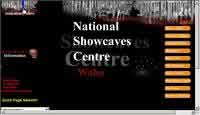
The "A Cave Can be a Black Hole of Death Creepy Navigation Award" Goes to The National Showcaves Centre for Wales:
Leave it to the Brits to come up with a Black Hole of Death. Navigational metaphors just don't work. Please stop using them. Thank you.

Vincent Flanders' comments: Watch the left-hand column closely as the page loads. Look! Some graphical navigation icons! No, wait, they've slipped off to the left! Nothing but a black space there now. How do I get them back?
Ah, wait, there's a message at the top flashing up very slowly. "Use the stalactites, immediately above, to navigate this site." Aha. I run my cursor over the stalactites. A link to "essential information" slides out beneath. I move the cursor down to click on the newly-revealed link — but it slides away before I get to it.
Other comments #1: Wow! Another incredible version of Mystery Meat Navigation. The sound of dripping water used on the site is enough to get me to confess to about anything.
Other comments #2: OMG, that's terrible. Deserves to be buried at the bottom of a deep cave (luckily for them, they happen to have one handy).
Here's a clue for designers — if you have to include instructions on how to navigate your site, you've not designed it properly. The bizarre thing is that they've produced some perfectly acceptable side menu graphics (not sure whether they really mean to have "meat [sic] the Dinosaurs" though) and hid them behind this rubbish MMN setup.
Oh, and if you haven't figured it out, you have to point your cursor at the stalactite, let the slidy out thingie tell you what it means and then click on the stalactite. I know those sliding graphics look like a menu, but they aren't.
Other comments #3: There's an accessibility issue here. The Principality of Wales has two official languages, English and Welsh, and they have equal status. A substantial number of Welsh people speak English only as a second language.
On this site, all of the text is in English. But much of the text (not, however, the navigation) can be read out to you if you place your mouse pointer over the appropriate flag. I suppose that's meant to be a compromise, but it does mean that hearing-impaired Welsh speakers — or Welsh speakers without sound cards, or Welsh speakers who worry about their bandwidth — are out of luck here. Not that the sound files are very reliable, at least not on my DSL connection.
Other comments #4: Ahh…so many bad web sites successfully hiding so much good content. When will people learn that the web site is just the mechanism and NOT the attraction? Have some fun by all means but please, please let me find what I am looking for.
 The National Showcaves Centre for Wales Clicking the link or the graphic above takes you to a video of how the site looked when it made this list.
 Here's a higher quality version of the same video at SmugMug.
The current website. Not as horrific, but still suffers from major web design mistakes.
The National Showcaves Centre for Wales Clicking the link or the graphic above takes you to a video of how the site looked when it made this list.
Here's a higher quality version of the same video at SmugMug.
The current website. Not as horrific, but still suffers from major web design mistakes.
The "Germans Can't Dance When They've Eaten Too Much Wiener Schnitzel Mystery Meat" Award Goes to Tanzschule Buck

Most of the Daily Suckers involving Flash have one redeeming feature: They are pretty to look at. This one, for a dance school in Hamburg, Germany, doesn't even look good. The splash page is the first time I've ever seen Flash used to emulate FrontPage.
They've "fixed" the site, although I think the new site still sucks — but in an HTML-kind of way.
Vincent Flanders' comments: I originally thought the site was going to be a bank. Once inside, the designer seems to have taken the idea of "dancing" a little too literally when the navigation was designed. It doesn't help that lady who runs the school also sells insurance: one of the links takes you to the insurance company web site for no obvious reason.
The vertical type on the dancing navigation that loudly beeps at you when you mouse over it is over the top.
Other comments #1: Interestingly, I note from the source text, that this actually is a FrontPage site. Does FrontPage now do Flash?
The colour scheme makes my eyes water. That bouncing marquee is the last word in kitsch, seriously. Oh, and not all of the pages have a title. The main navigation page is called "Neue Seite 1", which is German for "New Page 1".
Other comments #2: I like the way they mix in some English with their German. One of the dancing balls is labeled "Kids" whereas most of those balls have German labels. The word "kids" in German is Kinder. Click on the Kids ball and you get a flash Under Construction page (yes, the words "Under Construction" are in English).
As for the color scheme, red + yellow = psychedelic.
Other comments #3: Gott im Himmel!! Ve have vays of making you click!
Here's a quick video at SmugMug about how the site used to look and why it sucked.
Tanzschule Buck (Current "fixed" site)
Here's a quick video at SmugMug about how the site used to look and why it sucked.
Tanzschule Buck (Current "fixed" site)
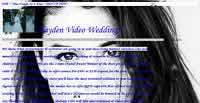
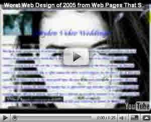
The "People's Choice Award for Overall Bad Web Design" Award Goes to Hayden Video Weddings
It's been fixed See below for video of original site
Originally, I wrote:
The readers of this site have spoken. Well, 1,000+ people have spoken through a poll I ran.
This site beat some very strong competition — heck, it beat a lot of the other sites that won in their category, including the site I picked as the worst of the lot (Brown University Grad School).
Well, of course, they fixed the site and today it looks like this. To say that it looks better is like saying Tom Cruise looks better than I look. On the other hand, it's excessive in a sugary "We're getting married" way.
To appreciate how far they've come, here's what the site that my readers voted the worst looked like:
Other comments #1: So much to love. I especially like the animated background, the image-only links (no text), the "BEST RATES IN THE VALLEY" item that makes the page extra wide, and this little gem at the bottom:
occasiONALLY WE HAVE A CANCELLED RESERVATION--
cALL FOR DETAILS ON DISCOUNTED RATES FOR LAST-MINUTE BOOKINGS!
i wonDER WHETHER THEIR BROCHURES LOOK THE SAME
Other comments #2: This web site illustrates the problem of people using WYSIWYG web editors. The editors themselves are just as complicated to learn as the HTML language itself. The people using the editors have no idea of what the underlying code looks like or is supposed to look like. Editing creates a mess.
This web site is split up into tables.
I think the "heading" at the top of the page is supposed to be centered. The author has used non-breaking spaces at the front of the line, and in between the words. It works if your browser is set to the right width.
The font SnowDrift is being used, at least by the author. I particularly like how the font CentSchbook TB is specified for displaying the graphic.
The concluding </html> tag has been deleted.
I think I got about a third of the way into the code. Someone else can continue this if they want. :)
Hayden Video Weddings (same link as YouTube video above)
Hayden Video Weddings (current site)
Hayden Video Weddings (same link as YouTube video above)
Hayden Video Weddings (current site)
The "Pope May Be Infallible When He Talks About Religion, But Not When He Talks About Web Design" Award Goes to Pope John Paul II

It's not every day that a dead pope is fodder for criticism, but today's the day.
Other comments #1: In the early ages of the Internet I often visited your web site for some tips or to show others why a particular solution or design they implemented didn't work.
Today after the passing away of the John Paul I thought I'd give his web site a try and look into the history of these things.
Lo-an'-behold is this bad navigation or what?
First there is a Mystery Meat Navigation with intrusive JavaScript popups and then there's "try to find a certain letter he wrote, only if you know the year he wrote it."
Other comments #2: I don't know whether to call this entry Mystery Meat Navigation or "Dead Meat Navigation." It's a perfect example of web page design gone crazy.
There are 95 images that have to load. That's just a tad excessive.
This is a sinful site and somebody needs to go to confession. Right now.
Other comments #3: Ah, it's no wonder they didn't notice anything wrong with it. The JavaScript is specifically designed to use Dynamic HTML for the popups only if a browser supports document.all or document.layers — otherwise it displays them as modal dialogs. No doubt the designers only tested the site in IE, so they failed to realize how UTTERLY BLEEDING AWFUL it is in Mozilla and Safari...
The "Worst Design on a Site That Discusses Web Design" Goes to Web Pages That Suck

You don't have to click the link, you're here.
I've always taken a perverse pride in the design of WPTS — it is, after all, called Web Pages That Suck — but a lot of people don't get it.
A longer explanation of why the site looks the way it does can be found here.
Why don't I change the design? I have changed the look over the years (and most of them are ugly).