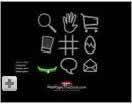
Mystery Meat Navigation: An Introduction
- Here are the sites -->
- Recent
- Corporations
- Art/Music/Film
- Web Designers
- Coda
Note: Some people have asked, "Where are the sites?" Well, the menu above should aim you in the right direction. I've included part of Wikipedia's definition of the term, some short videos of sites who used to use MMN followed by the same links as above in a section called "More Examples of Mystery Meat Navigation."
The following video is the best example of Mystery Meat Navigation.

Definition and Discussion
Wikipedia's defilnition (partial):
Mystery meat navigation (also known as MMN) is a disparaging term coined in 1998 by author and web designer Vincent Flanders to describe a visually attractive but concurrently inefficient, confusing, or abstruse user interface, usually one that is Internet-based. Such interfaces lack a user-centered design, emphasizing aesthetic appearance, white space, and the concealment of relevant information over basic practicality and functionality.
The epithet "mystery meat" refers to the meat products often served in American public school cafeterias whose forms have been so thoroughly reprocessed that their exact types can no longer be identified by their appearances: like them, the methods of MMN are clear to the producer but baffling to the consumer.
MMN is very seductive — it looks cool and it's used on sites that win design awards. Because there's no long strings of text, MMN makes the page look "cleaner" because there's more white space.
More Video Examples:
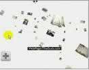
Toto

Using human butts as navigation brings new meaning to Mystery Meat Navigation <grin>.
Toto (2:05)
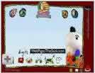
OXO
An early example of Mystery Meat Navigation from late 1999 or early 2000.
OXO (2:02)
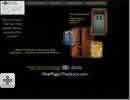
Mathew Mahon
Stupid Mystery Meat Navigation. Oops. "Stupid" is an unnecessary modifier.
Mathew Mahon (1:18)
 Crumpler Bags
The #2 worst Mystery Meat Navigation site for 2006.
Crumpler Bags (1:15)
 Diners Club
The 10th worst web site of 2006,
Diners Club (0:42)
 University of Calgary
They fixed the site. This is what it used to look like.
University of Calgary (0:45)
More Examples of Mystery Meat Navigation
Because of length issues, I've had to break the article into multiple parts.
Recent Examples of Mystery Meat Navigation
Big Corporations or Classic Examples of Mystery Meat
Music, Movie and Art Mystery Meat
Web Designer Mystery Meat
Coda


