Mystery Meat Navigation: Recent Examples
Here are some recent examples of Mystery Mean Navigation (MMN) pulled from the pages of Web Pages That Suck:
FlatPak

Submitter's comments: Check this one out because it uses lots of Mystery Meat Navigation.
Vincent Flanders' comments:
And it's Flash-based MMN. I shake my head every time I see a site like this. It appears — and it's important to stress the word "appears" — that this is a company with a really cool product who have ruined their site by trying to be...really cool.
I suspect they've looked at too many architectural firms for influence. We don't need the Flash and we don't need the MMN. It's that simple.
Blue Bell Ice Cream

Submitter's comments: The best ice cream in the country – but the worst web page. I think Blue Bell Ice Cream's latest main page redesign sucks. I have to hover over everything to find what I'm looking for.
Vincent Flanders' comments: God Almighty. If there's one thing that's been my downfall in life (in the food category), it has been ice cream. If there's one thing that's this site's downfall, it's Mystery Meat Navigation (not a food category).
The site seems to start out nicely. The cute little girl seems OK, but the “enter site” link looks like it's connected to the “log in” and “sign up” links. Do I have to register to use an ice cream site? Actually, no. It's somewhat confusing. If you take the time to scroll down the page, you'll see there's a full set of text navigation. Most people aren't going to scroll.
Clicking the “enter site” link takes you to the Mystery Meat. Yes, it's well done and it looks nice, but so what? Navigation is supposed to help you get from Point A to Point B.
God help me. One of their brands is Peaches & Homemade Vanilla. I'm doomed.
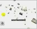
mxyplyzyk

Submitter's comments: I think it's pronounced 'suck.'
Vincent Flanders' comments: You've got Mystery Meat Navigation where the meat changes — fortunately, the links stay the same — and a needless use of Flash plus, for some reason, they're using the https protocol. I don't understand.
What really sucks is that you have itty-bitty little thumbnails of the products. The problem is that you're not sure what they represent until you click them. On the "Kids and Pets" page I clicked on a picture of a dog. Turns out it's a pillow. How is it possible for me to know that? You just wasted my time. Actually, the whole site is a giant waste of time.
Market Pro

Submitter's comments: Mystery Meat Navigation Definition (MMN) alert.
Vincent Flanders' comments: A very nice example of why MMN shouldn't be used. At least it's not the main navigation, but it's Flash-based and Flash shouldn't be used for navigation.
We also have some text contrast problems on subpages. Why?
Zinc Bistro

Submitter's comments: It's been a while since I've seen Mystery Meat Navigation used on a website, so I thought I'd send you this site. Honestly, I don't see this much any more — see if you can find the navigation on this page (hint: it is next to the little graphic that says "Navigate" and has an arrow pointing to it. Even then, it takes a moment to realize what the heck is going on).
I was floored that I couldn't just click what appeared to be the "Lunch" or "Dinner" graphics at the top. The music which plays when the page loads is also one of my biggest pet peeves.
Vincent Flanders' comments: Whenever someone says to you,"There's nothing wrong with using Mystery Meat Navigation," send them to this site. I hereby revoke my Mystery Meat exemption to band, art, personal, music, et al. sites until such a time as site owners and designers become responsible citizens. If people see something stupid, they want it. This has got to stop.
Fry Steel (it's been fixed)

Submitter's comments: My nominee is a site that abounds in fancy graphics, but offers little help in the way of finding out what products the company offers, has in stock, and how to actually place an order. It is a tour de force of flash graphics, but the navigation is nearly impossible to figure out. After finally locating their "terms and conditions" page, one finds that it protects the web site content, but says nothing about how to do business with the company behind it. After all this artsy-fartsy stuff, you still have to use a telephone or fax machine to contact the company itself. How ironic.
Vincent Flanders' Comments: I've said it's OK for music, art, movie, and public relation sites to use "Mystery Meat Navigation" (MMN) because nobody really cares about them and they are legally obligated to look cool. I've also said that the problem with MMN is it influences companies who aren't smart enough to realize they're not in the music, art, movie, and public relations business. When a manufacturing company starts using MMN you know that we've reached a new low. They've fixed the site, but I have the video catching them in the act.
Fry Steel (Video - they fixed the site)