Worst Websites of 2008 Old School #1-5

There's good web design and there's bad web design and then there's Old School web design. If you go to a website and it looks like a website you saw back in 1995 through 1997, then you're looking at Old School web design. Professional web design companies do not create Old School websites.
2008 was a good year for bad Old School web design
Sites that use Old School web design make a variant of Mistake #6 from Biggest Mistakes in Web Design 1995-2015 — Have you looked at a website since 1997? Really? Doesn't look like it."
Often these sites also suffer from "WTF Syndrome." You look at the site and mutter, "What The Heck were they thinking?"
Don't forget to check out Part 2: Worst Old School #6 to 10.
1. Burlington UFO and Paranormal Research and Education Center
I think there are two possible reactions to this site. As the great movie reviewer Mr. Cranky has said:
- “This is so god-awful that it ruptures the very fabric of space and time with the sheer overpowering force of its mediocrity.”
- “Proof that Jesus died in vain.”
Submitter comments: In order to fully appreciate this site, you have to scroll down…way down… you won't believe how much crap is crammed on one page. I didn't think it was possible — and in rainbow colors. I strongly advise against clicking any of the links as it takes you to equally horrendous pages and sites.
I now have a headache.
Other comments #1: Scroll down almost to the bottom and check out the shot of Bubba in the sauna with E.T. Priceless, absolutely priceless.
Other comments #2: They seem to be fairly shameless in using .GIFs for visual effects. Examples are near Multi-megabyte .GIF files for stuff that could be done in JavaScript such as slideshows and transitions between images. Spidering the site, I do not see a single external stylesheet or JavaScript file. Inconsistent multimedia formats, WMA, RM, QT, MPEG, AVI, WAV, and MP3. Sadly, the sitemap follows the same design scheme as the rest of the site. Designed in Yahoo Page/Sitebuilder.
2. International Ghost Hunters Society
I think we have a new champion in the category “Main Navigation That’s So Far Away It’s In The Next County.” The navigation is almost 13,000 pixels from the top of the page.
There are a lot of other things wrong — flush left and centered text, multiple font sizes, ugly, blue divider bars, ugly background, animations, tables with borders, clickable images with borders, and images with white background that look ugly against the regular background, and so on, and so on.
Here’s a full-length screen capture
Here’s a screen capture that gives a feeling for the length of the home page
There is some centered text that says, “Telephone the Dead Today.” I’d change it to “Telephone a Web Design Firm Today.”
Other comments: As one who is, uh, also involved in this field of study, I have to say most websites covering this topic are absolute garbage…it's frustrating, because some of these people really know their stuff, but if my only impression of them was based on their web presence, I wouldn't hire them to do ANYTHING in my house, much less scientifically and methodically investigate it. It's also frustrating because, as community/web relations director for my organization, I have to read these sites on a regular basis.
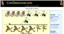
3. Cow Dance
I was searching through Google — don’t ask me what I was searching for — and I stumbled upon this site and my eyes bled. Submitted for your approval: Cow Dance Wear.
I’m willing to bet that everyone but the designer can see all the mistakes.
4. We The People
Submitter’s comments: Vincent, I love what these people are doing. Namely, pushing for a return to a more Constitutional form of government. Their website really sucks, though. For starters, their home page goes on FOREVER.
Oh, and the link at the top of that home page goes to a page in which, when you roll your mouse over the top navigational links, you’ll find that the mouseover images aren’t showing up. Someone fell asleep at the switch there…
Vincent Flanders’ comments: It looks like every article they’ve ever written is on the home page, which weighs in at 972.91Kb. They’re wasting their visitors’ time and, more importantly, they’re wasting serious money on bandwidth. I suspect if they just kept the last 3 or 6 months-worth of material on the front page and put the rest on subpages labeled 2007, 2006, 2005, and 2004, they could get the page down to a reasonable size and save lots of money on web hosting fees.
The graphic below shows the mouseover the submitter was talking about. It’s on the page about Soon-To-Be-President Obama’s birth certificate controversy page:

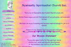
5. Newcastle Spiritualist Church
I stumbled across this charming and delightful site recently. I'm glad I was sober or I might have tried to remove the freaking coloured flying things. (Yes I'm sure they have a name, but I don't care because I'm never going to use them on my website under any condition.)
Aren't the colours purty?
Newcastle Spiritualist Church screenshot of original site
Newcastle Spiritualist Church current site
Newcastle Spiritualist Church old URL
Page 1 of 2 Next: Worst Old School #6 to 10

